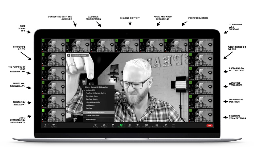
Chapter 4
Defining Your Presentation’s Purpose
A key trait of successful speakers is understanding their personal brand. They know what they represent, how they want to be perceived, and what success looks for them. It’s common for this knowledge to accrue with experience, but you don’t have to wait for your 10,000 hours in order to get to that point.
You’ll achieve success sooner if you follow the steps below.
- Define who you are as a speaker
Are you a motivational speaker, an entertainer, a teacher, or a combination of all of them? Deciding on this highest level of goals will help you keep your talks on track, and remind you why you do what you do. For me, my goal is always to entertain, educate, and inspire—in that order. The vast majority of my energy comes from the energy of the audience, in the form of laughter. - Know what you’re good at and what you’re not
Not everyone is funny, and not everyone can speak for an hour without any slides while making people weep with joy. You need to be honest with yourself in order to optimize your presentation design. Bombing when you try to tell a joke is painful for everyone, and it will deflate your energy on stage. So if your key skill is data visualization? Wow people with that and leave the jokes to the comedians. - Establish what you want the audience to experience
Do you want them to laugh, or scribble copious notes, or enjoy a community experience interacting with their neighbours when you engage them in audience participation? - What does success look like?
When you know what you want the audience to experience, you can use it as your metric for success. If you want them to share photos of your slides on social media, you can measure that. If you want them to download your slide deck PDF from your landing page, you can measure that. Want them to laugh 15 times during your talk? You can measure that. Standing ovation? Well, we all want that. If you don’t have your success criteria defined you can’t gauge if you’re succeeding as a speaker. Optimization of your talks comes from observation. If that 11th joke fell flat, remove it or figure out why and change it. - Develop an “Original Content” mindset
Something that can really make your talk stand out is when your content is completely original. You took the photos, you recorded the videos, and you did the research—which can be something as simple as a series of Twitter polls. Seeing stock photos in a presentation is lame, making the audience feel cheated. In one of my talks I needed to demonstrate the ridiculously endless choice in supermarket toothpaste aisles. I could have shown a photo like this:
But instead, I went to the supermarket with a friend (who was wielding my phone as a camera), and took a series of seven shots like this:

The result is content that nobody else in the world has. This is critical if you’re speaking about a topic that many others speak about (the psychology of shopping behaviour for example). You already have your own original take on the topic, but if you use the same photos/charts/data points as everyone else, your message is watered down by the sameness of the visuals—even if what you are saying is completely new.
At the end of the day, it comes down to extra effort and hard work.
- Develop a “Diverse Content” mindset
Your audience will (hopefully) contain a broad and diverse cross-section of people. People respond best when your content is reflective of them. By developing a mindset of diversity, you can source different examples, use quotes from more varied sources, and recommend tools, businesses, and the advice of those who reflect more than just your own image. Not only is it the right thing to do, I guarantee it will make you stand out as a speaker people trust.
Chapter 5
How to Design the Structure, Story, & Flow for Your Next Virtual Presentation
Presentations are unequal parts art, structure, story, design, interaction, flow, balance, emotion, and technical production. Sounds simple. It’s not. But it’s made much easier if you’ve defined the purpose of your talk (as described in the previous chapter).
Try these tips to get a head start:
- Reduce your big idea to a small one
Can you recall a time when a colleague, stranger, or family member asked what you do, or what your latest talk is about? And you meandered for 2 minutes trying to explain it, only to leave them with a puzzled look on their face. Don’t worry, we all do it.How do you get past this problem? The best way I know—and this works equally well for an elevator pitch for a new startup—is to do a reduction exercise.It works like this: you write down a long series of bullet points that describes, in detail, everything you want to communicate in your talk. Dive deep into the minutiae and unpack it all.Once you’ve done it, start again, but this time, instead of 94 bullet points, you have to do it in 47, then 24, then 12, then 6, then 3, and finally 1. By the time you’ve completed this exercise you’ll have such a strong sense of your talk’s value proposition that you’ll be able to rattle it off without thinking.Not only will this help you describe it to someone, but you’ll be able to write better titles for your talk, and you’ll have a deeper understanding of all aspects of your content.It’s also a great dumping ground for all of your wildest ideas.
- Chunk your talk into “bits”
This is a technique that comedians—some of the best storytellers on the planet—use to fantastic effect. It’s pretty simple in its execution. You go through your talk and break it apart into sections that make sense by themselves.This could be the intro, section 3 of your 7 points, or a story you tell in the middle. Whatever it is, practice the heck out of that part in isolation. You still need to practice your talk from start to finish, but this tech is so useful on several levels.
- First, when you really know a section, it gives you confidence when you get to that point when presenting because you know it! and your execution and delivery will be much tighter.
- Second, when you know a segment well, you can learn how to shorten or extend it depending on how much time you have. Sometimes you’re so short on time (you went slow or the previous speaker ran over their time) you have to cut pieces, and if you know them intimately you can whip off a quick summary of the whole point and tell the audience to check your slides afterwards. Conversely, if you have a lot of extra time all of a sudden, you can slow down and dig deeper into the topic than you thought you could.
- Third, it allows you to ad-lib. This is one of the highlights of every talk, and something that comes with experience. It’s always a really fun moment because you just let loose and find new points and angles to your message–which is often where the true brilliance in your talk will emerge.
- Fourth, aren’t you enjoying a break from standard bullet points in this section?
- Fifth, over time you will start to build what I call a “Greatest Hits Deck” (GHD) where you store your very best work. It’s much easier when you have your bits chunked to grab 15 slides and copy them into your GHD. GHD’s are really useful when you get invited to give a talk to an audience you know isn’t familiar with your work. And instead of giving a new talk that you might not have time to prepare, or a recent talk that didn’t go down well, you can whip out the GHD and be an absolute crowd favourite. Whenever I get to rock my GHD I’m over the moon and look forward to the event even more.
- Establish an opening hook
The start of your talk is the only time you will have 100% of the audience’s attention. They are sitting in anticipation of what’s to come which makes it a really important moment to get right.Starting with “blah blah blah, hello, blah, blah, a little about me, blah blah” will send people straight to checking Facebook.See if you can find a dramatic or bold statement, or tease the outcome of your story without giving it away. Experiment saying things out loud and see what feels like it’s going to build excitement. The magic comes when you open with that statement—without saying anything, ANYTHING—before it.
- Create a closing call to action
“Thanks. See ya later!” Nope, don’t do that. You have a golden opportunity to ask the audience to do something. If they’ve stuck around ’til the end, you’ve probably done a great job, providing the audience with a ton of value. Choose between these options for what you want them to do next:- Visit your talk resources landing page to get your slides and all the other goodies you mentioned.
- Connect with you on whatever social platform you prefer, to ask any follow-up questions. This is a fantastic way to create a 1-1 engagement with someone.
- Promote your latest “thing” whatever that may be. You earned it. And if you did a good job of not being a salesy speaker, the audience won’t be against you doing it. If you pepper your talk full of sales however, they won’t like that.
Chapter 6
40 Slide Design Tips for Zoom Presentations
The topic of slide design requires multiple intensive courses to cover all you need to know (I’ll be releasing those in due course), but you’re probably sick of scrolling in this guide so I’ll keep it short and sweet. By short I mean huge, and by sweet I mean sweet.
In this chapter I’ll cover:
- Slide design basics
- Finding content for your presentation
- Using media in your slides
- Animations and transitions
- How to show data in your slides
- Using paid presentation templates to accelerate your work
- A few cool design tricks
- Making your slides Tweetable and shareable
- Using master slides (Keynote has respectfully changed this term to be “Slide Layouts”, PowerPoint still uses “Slide Master”)
Told you it would be short.
Part 1 – Slide Design Basics
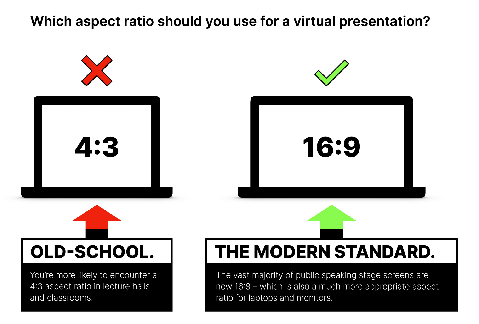
#1 Use the 16:9 aspect ratio (not 4:3)
The old-school aspect ratio for slides was 4:3. This was established based on the shape of those projector pulldown screens common in classrooms. However, it’s more common—and significantly more modern and cinematic looking—to use a 16:9 aspect ratio. This is how most on-stage screen look, and it closely mirrors how laptop screens and computer monitors are designed.
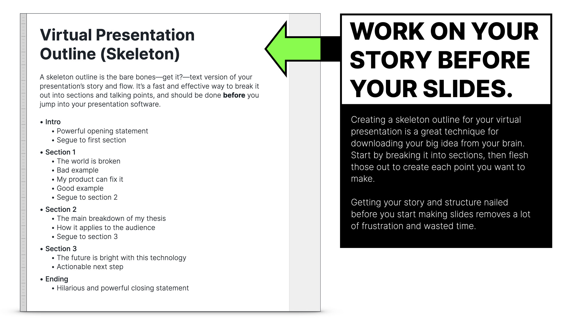
#2 Don’t open your presentation software until you’ve outlined your talk
This is precisely why this chapter comes after defining your presentation’s purpose. By starting your work inside PowerPoint, staring at a blank slide, you’re going to work more slowly and will end up with spaghetti slides that don’t have a coherent structure.
A skeleton outline breaks down the sections and subsections of your talk into a simple list. This view makes it easy to re-order the sections to create the right story arc.
Once you have your outline, it’s time to open the software and work on your slide layouts to create the structural chapter/section slides. But don’t add your content until you’ve established a theme (if you want one) and your typography selection.
#3 How to choose a theme for your presentation
Themes can be good and bad. Having an overarching concept to follow can make things easier for you, but if you choose one based on a currently popular meme, you can end up looking like everyone else who also had this bright idea. Star Wars and Game of Thrones themes for example, are insanely overused.
If you know the makeup of your audience, and know they’ll be familiar with the theme it can work in your favour, but if it’s an atypical audience for you and they don’t recognize your inside jokes, GIFs, and topical references you risk falling flat.
It can, however, be a good tactic if it fits with your goal as a speaker (to be known for your themes).
Personally, I like to create my own theme from the talk concept. Sometimes based on a known theme but then expanded into my original style.
As an example, I did a talk called “The Conversion Equation” which was very mathematical in nature. I started by creating an opening slide, taking my own photo based on the movie A Beautiful Mind and then built out my own designs following that.
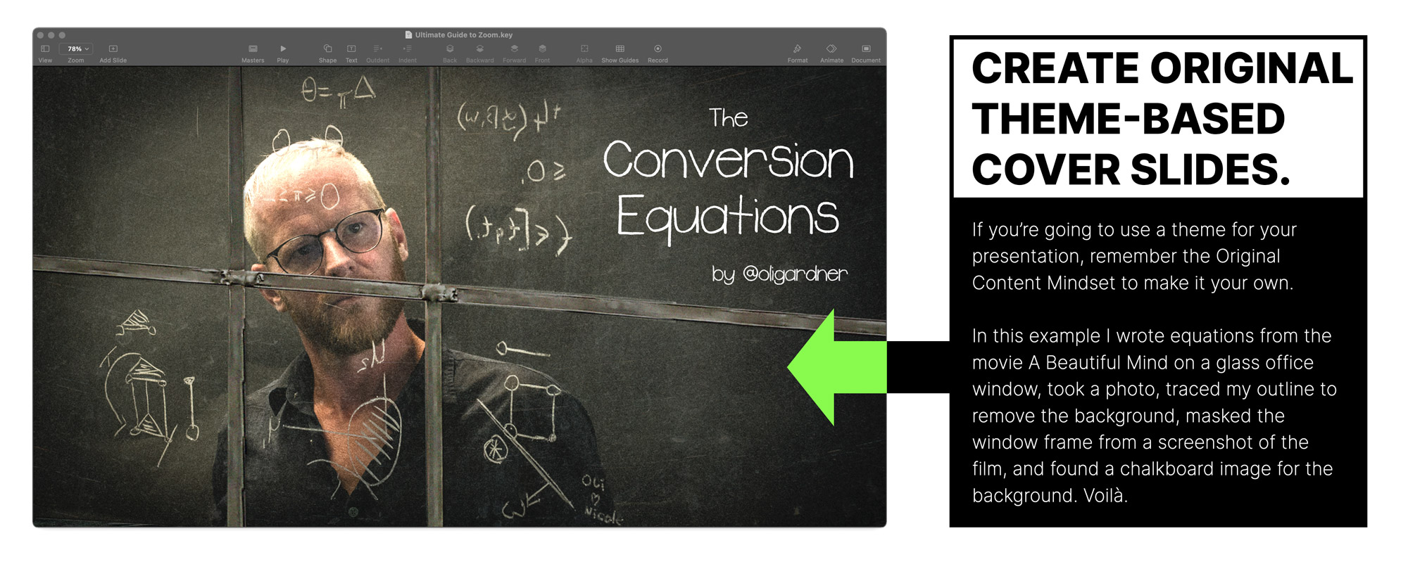
Yes, I used a known theme as the opening slide, but I used the original content mindset from the previous chapter to make the bulk of the content my own.
I used a chalkboard to channel Matt Damon in Good Will Hunting for other parts of the design. Slides like these can take a lot of time to create but they are well worth it because they will be memorable.
I’ll be doing design breakdown videos in the future, that show how I did this.
At the end of the day, you do you.
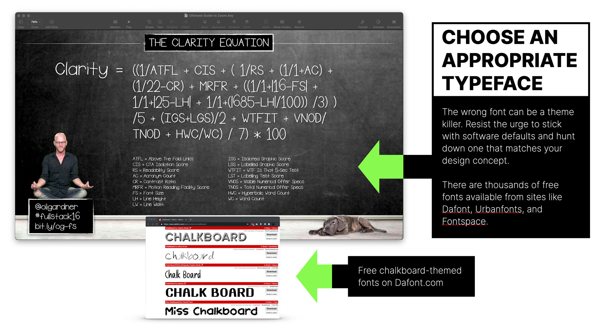
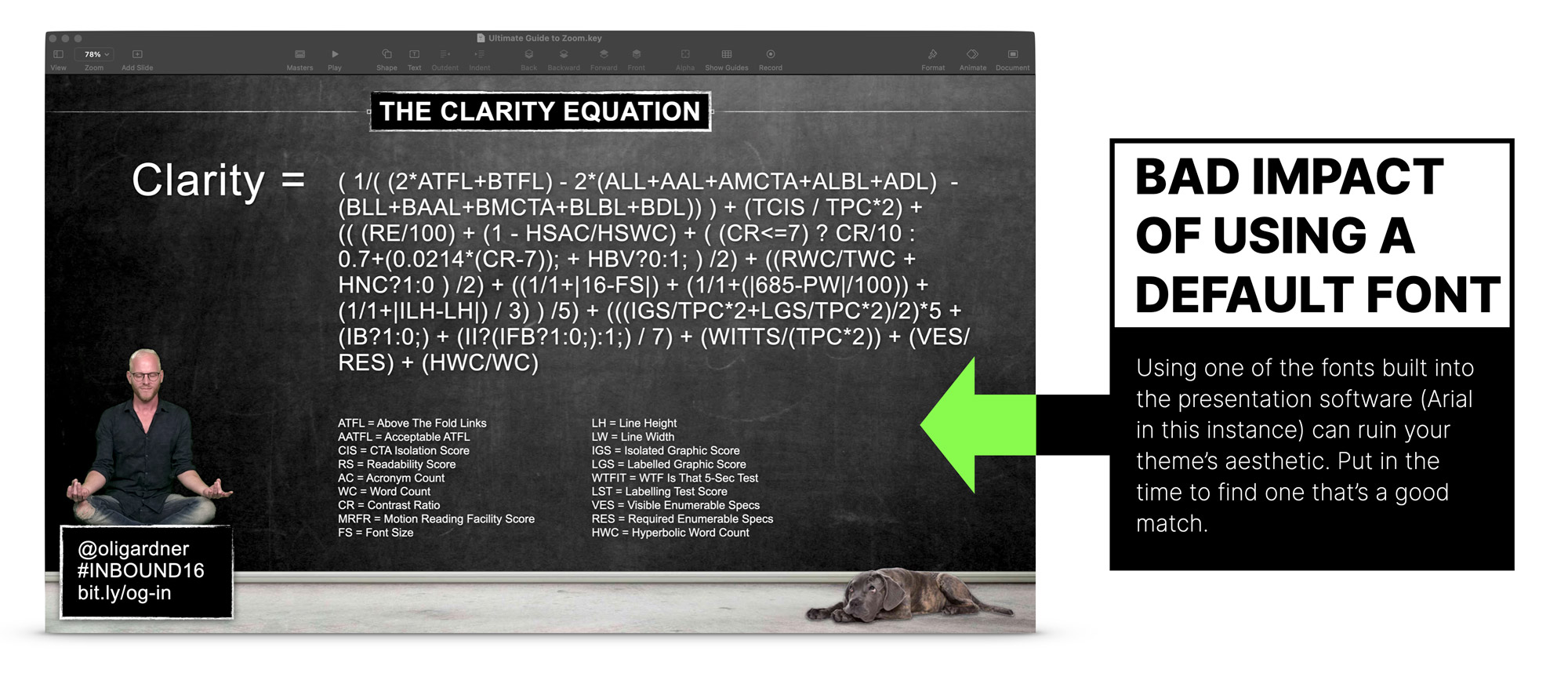
#4 Choosing and finding a typeface (font) that matches your presentation theme
When working with a theme, it will only work if the typeface you choose merges seamlessly with the concept. Fortunately, there are thousands of free fonts available to help you create the right aesthetic and avoid the standard selection of typefaces that’s bundled into your presentation software.
In the following example (the chalkboard background) I hunted through free font sites for a chalkboard style. You can see the search results from the font site DaFont.com.
To demonstrate the importance of choosing an appropriate font, consider the example below where I used Arial, one of the many bog standard default fonts. It looks pretty terrible, and the theme is diminished as a result.
#5 How and when to use agenda Slides
For some types of presentation you’ll be giving on Zoom, such as an internal corporate presentation, it can be really helpful to lay out in advance what will be covered. While this isn’t something I do personally—I like to keep it all a mystery—it can help set expectations.
The only thing I ask of you if you have an agenda slide, is to use the Progressive Reveal technique so that you’re not kicking off your talk with a giant wall of text.
Which brings me to my next point.
#6 Learn the progressive reveal technique to make your bullet points amazing
The Progressive Reveal technique is the best way to present a lot of information on your slides while keeping the attention and focus of your audience while you do it. It’s most commonly associated with bullet points but can also be used for:
- Famous quotes
- Data
- Slides that tell a story
You can read about the Progressive Reveal technique in detail here.
Or you can watch the Progressive Reveal video below.
Video powered & sponsored by Wistia
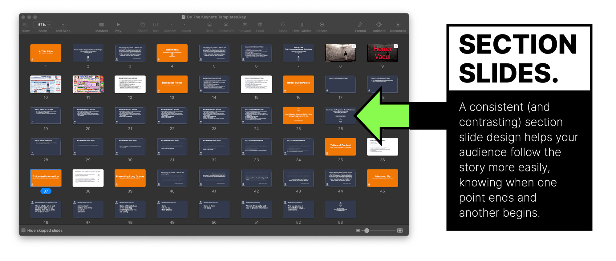
#7 Using section slides to keep your audience aware of your progress
Section slides help break down your talk visually for the audience. A consistent design provides a visual cue that you’ve reached a new chapter. It’s also helpful for you to find your way around a large slide deck. A nice bold solid colour is often a good way to go.
In the example below, see how the orange section slides stand out.
#8 Using recap slides to end each section with a takeaway
A slide at the end of each section that recaps the major takeaway(s) from that section can help the audience retain the information more easily before you move to the next section. Don’t do this for a really short talk as it’ll be overkill.
Without question, the top question (but you said without question?) of all virtual presentations is “Will you be sharing the recording/slides afterwards?” You can mitigate this question by including a reminder slide at the end of one or two sections. It helps attendees relax knowing that they can focus on enjoying the presentation without fear of forgetting any important details.
#9 When and why you should use appendix slides
Use cases for an appendix are likely limited to academia or research presentations, but they can be used to collect references, resources, and any of the finer print that you can’t communicate on your slides. By including an appendix loaded with useful information, attribution, and references, you are upping the value of the PDF you make from your slides.
Part 2 – Finding Content For Your Virtual Presentation
The core of your content is undoubtedly your big idea, but it still needs to be enriched by examples to bolster your premise, or expand on certain points. This includes photos, videos, quotes, data points etc.
Unless you’ve discovered a new dinosaur in your basement, chances are that there is probably someone, somewhere, doing a similar thing. You need to work a bit harder when finding and creating examples to make sure your talk is as unique as possible.
Here are a few tips for finding fresh content:
#10 Don’t use the first thing you come across in search results
This is what most people do, and it’s guaranteed to result in generic, overused content that doesn’t stand out as useful, original, or thoughtfully curated.
#11 Remember the original content mindset and create your own content
Create as much of your content yourself by taking photos, recording videos, running experiments and doing your own research. Unless you’re an academic or positioning yourself as sharing statistically/scientifically significant data, you can create a unique perspective with simple social media polls, or by interviewing a handful of people.
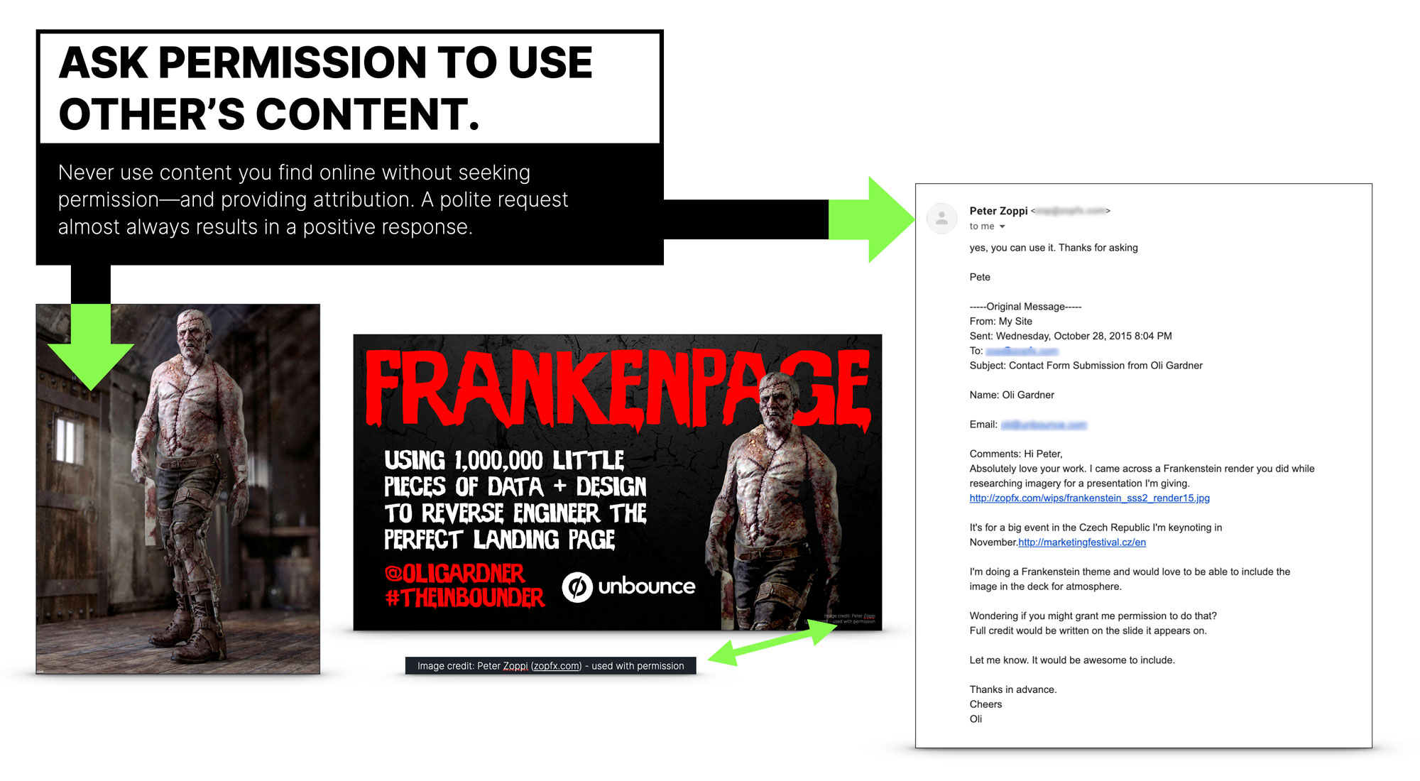
#12 Ask permission before you use anyone else’s work
If you find artwork, photography or other visual assets online that would be perfect for enhancing your slides, you must ask for permission to use it. Using other’s work without permission is theft, and not acceptable. The good news is that most people—when asked—will gladly let you use their content in your presentation.
To illustrate, I created a talk called Frankenpage and needed a good image of Frankenstein. The very best that I found was a fantastic piece of digitally rendered artwork, and fortunately the artist’s website was listed, so I reached out to ask for permission.
He said yes, which was wonderful.
Something that I find to be universally true, is that people really appreciate you asking for permission as there are a lot of bad people who rip things off.
#13 Localize your content for the country or city you are speaking to
Watching a rockstar walk out on an Edinburgh, Scotland stage in front of an audience of 50,000, and greet the crowd with “Hello England!!!!” is an immediate buzz kill. I’m talking about you, Dave Mustaine of Megadeth.
Conversely, if you’re giving a Zoom presentation to an audience in London, Paris, Tokyo, or Weed, California, if you can rock up with a ton of localized content, you’ll immediately be a hit. The audience will thank you for showing up thinking about them, and the content will be more easily relateable.
A really clever technique for finding localized content is to use a VPN.
A VPN effectively transports your Internet connection to another location where you’re more likely to get local results when using a search engine.
Read how to Use a VPN to Find Localized Content for Your Next Presentation for a deep dive into how to do this.
For even more bonus points, translate some of your slides if you are presenting to a foreign-language audience. Just make sure you double-check the translation.
Before delivering a talk to my biggest live audience (6,000), I translated 250 slides into Portuguese. The (intended) title of the talk was “The Internet is Broken and Marketers are to Blame”. Unfortunately Google translate wasn’t accurate enough leaving me with an opening slide which in Portuguese read “Someone Turned off the Internet, and it’s the Vegetable Marketer’s Fault.”
Hilarious.
Part 3 – Using Media in Your Presentation Slides
#14 How big should an image be on your slides?
You know what I hate about most slides that have photos on them? This…

And no, I don’t hate parrots. Parrots are awesome. What I hate is all the wasted space around the photo. To be fair, this is almost always the fault of the presentation software (this example is from a Keynote template), but it results in tens of thousands of slide decks full of ineffectual imagery.
Then what to do, Oli? What to do? It’s reaaaaally easy. Use the whole slide.
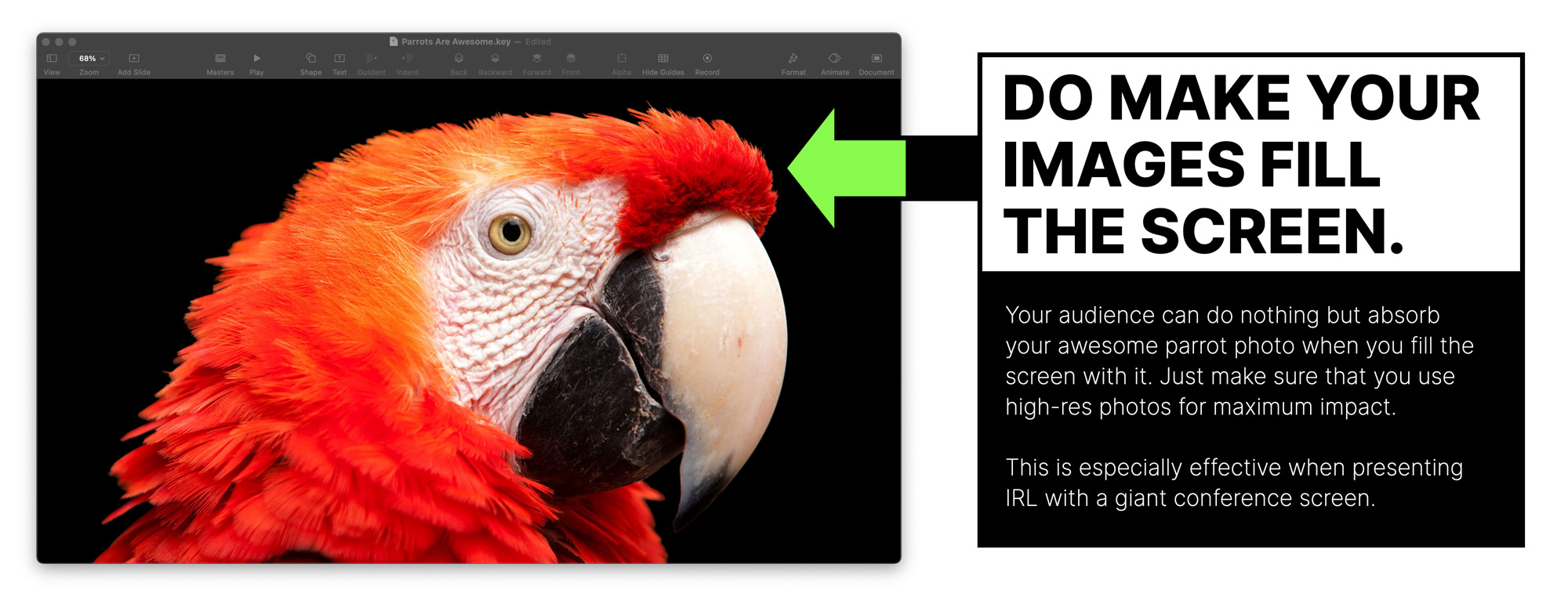
It’s much more dramatic and when you see it on a big laptop, monitor—or even better IRL on a giant stage—it sets the screen alive. Impact is important in slide design.
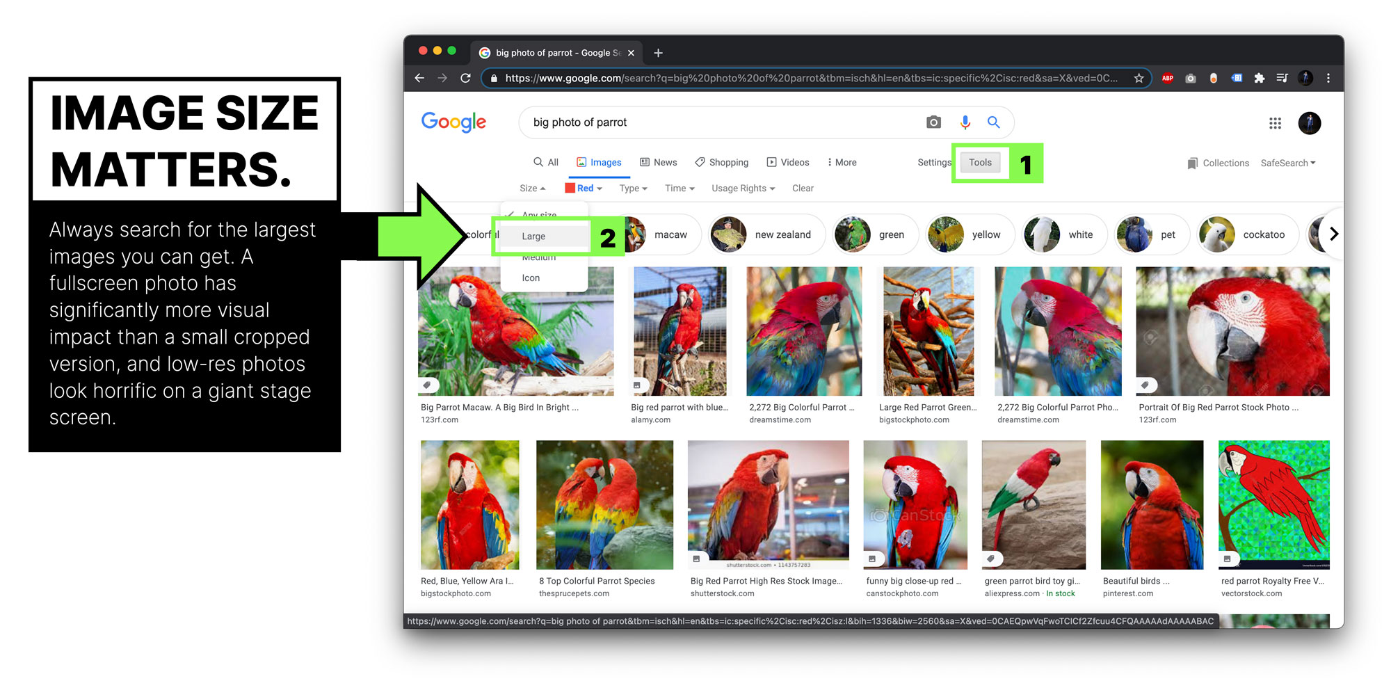
If you took the photo yourself you should have a nice high-res version so you’re all set, but if you’re sourcing photos/GIFs from the search machines, you can use a simple technique to get images as big as possible.
Use the size tool in Google image search.
Similarly, if you’re taking a screenshot to use in your presentation—a great way to create original content btw—take a big one like I did there ^^.
I could have done it like the one below, but that would’ve left me with a lame screenshot.

#15 How to use video in your slides
It’s doubly important to use fullscreen videos in your slides. Think about how you watch TV, sacrificing 60% of the screen would make it unwatchable. A fullscreen video removes any distractions.
In terms of the audio in your videos (or just an audio clip), I’ve said it several times in this guide but it bares repeating. Make sure the volume levels on all of your A/V slides are the same, and as close as possible to the level of your mic. More on that in Chapter 10 – Video and Audio Recordings.
#16 Using animated GIFs in your slides
A presentation decision that afflicts most beginner speakers is the way they use the wonderful/hateful Graphics Interchange Format or GIF for short. I’ll leave you to debate among yourselves whether or not to call it GIF or JIF. Okay, I’ll step in actually. JIF is technically the correct to pronounce it, but it sounds really weird when you say it like that. Sorry, not sorry.
Mistakes presenters make with GIFs:
- Low res GIFs
This is most often because GIFs get generated by—you guessed it—GIF generator software and they’re tiny, averaging around 500px on the long side.
- Overused meme GIFs
EVERYONE is using them because they’re ridiculously popular. Don’t add to the problem.
- Not scrolling in the search results
Because they’re ridiculously popular, you need to exercise your finger just a little more than the average person to find one that’s perhaps a little different.
- Leaving it on the screen too long (this is far too common)
If your GIF didn’t make the audience laugh, having it on repeat in the background as you start your next point is even less funny. It’s almost worse if they did find it funny, because while you’re starting to talk about your next point they are paying absolutely no attention to you as they chuckle away like children.
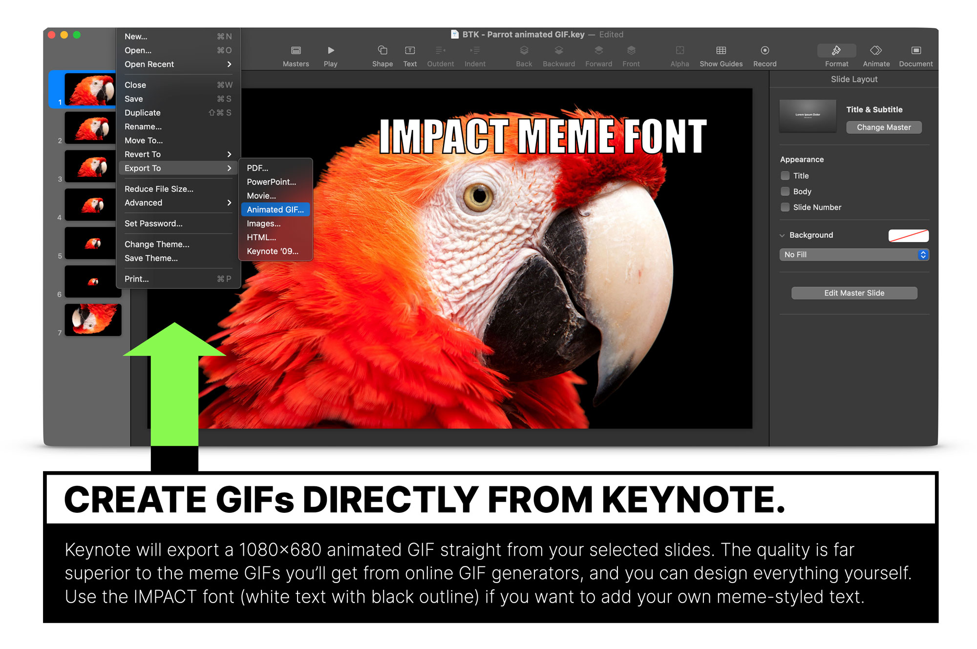
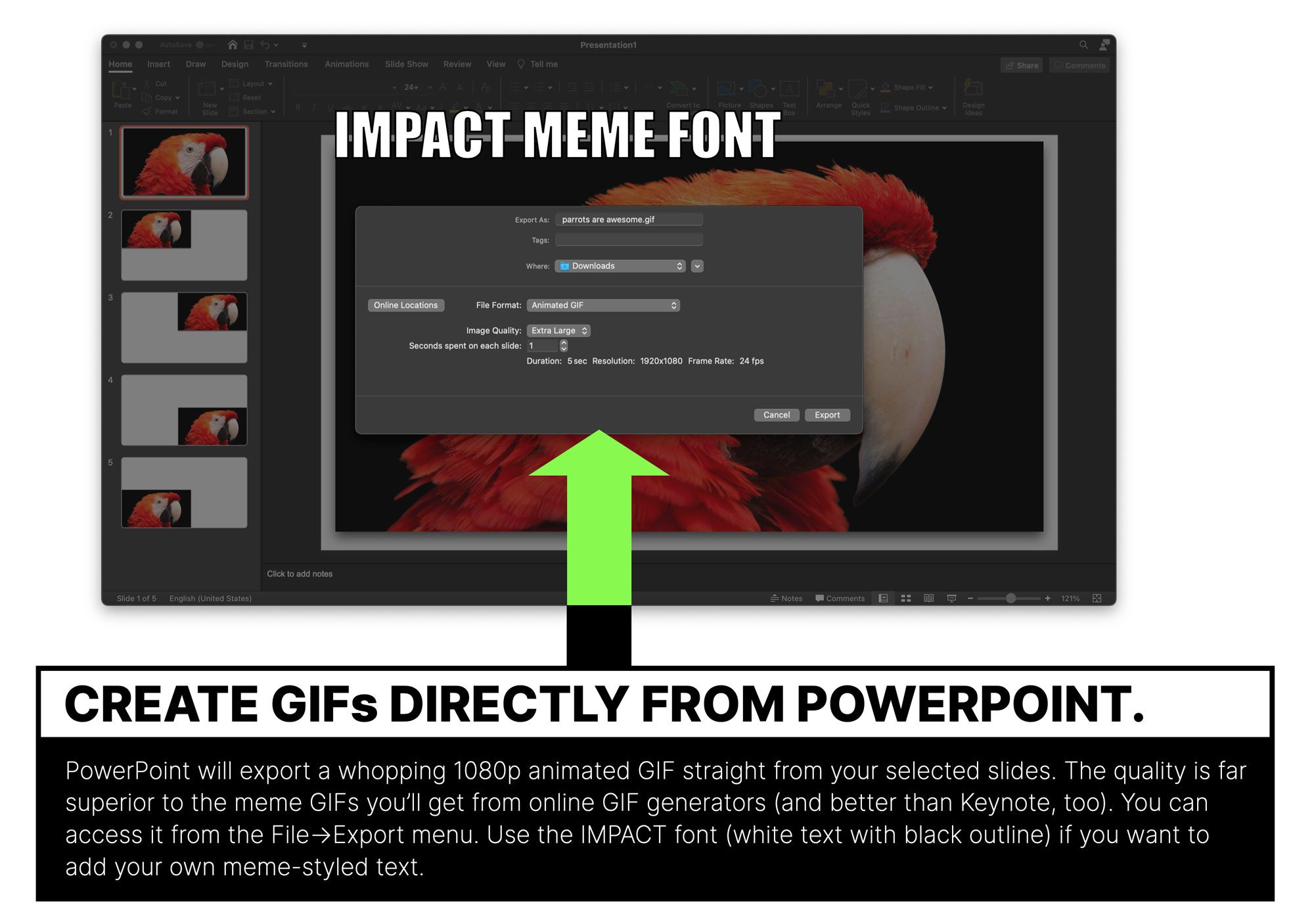
#17 How to make your own high-resolution GIFs
You can use PowerPoint and Keynote to make your own higher-res GIFs, simply by choosing the “File>Export>Animated GIF” in PowerPoint or “File>Export To>Animated GIF” option in Keynote. Boom.
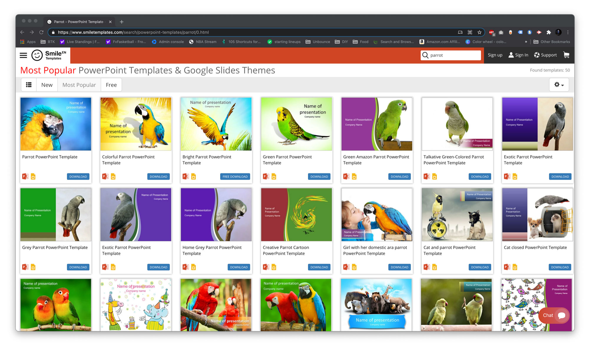
The parrot GIF below took me all of 60 seconds to make, it’s original content, uniquely mine, and it’s totally awesome. Because parrots are awesome. Am I creating a parrot theme? Not intentionally.
As I wrote the end of the previous paragraph, it sparked a very meta action, in that I wanted to check if there were actually parrot themed slide templates, cos that would be funny right? It would also mean I could inject some “original content mindset” content right here, right now.
I give you… PARROT PRESENTATION THEMES! Wow.
PowerPoint renders GIF as full HD 1920×1080 (amazing!) while Keynote is slightly smaller at 1080×680 (disappointing but still good). Both of them are significantly bigger than the average you’ll find in search.
Here’s the GGGGGGGGIF in action.
Here’s the GGGGGGGGIF in action.

You’ll understand what I mean by leaving it on the screen too long if you’re reading the next section while this continues to annoy you.
Final point on GIFs. Please don’t use a “Winter is Coming” GOT GIF in your slides. Ever.
Part 4 – Using Slide Transitions and Animations in Your Zoom Presentations
#18 Don’t use animations or transitions because you think they’re cool
The goal isn’t to be cool, it’s to be useful. Slides animations should always be additive: your goal for the slide should be achieved to a greater degree with the animation versus without.
Don’t worry though, if you do it right it’ll still be cool.
#19 Don’t use animations and transitions because they’re there
Presentation software is as much the problem as it is the solution. They come loaded with effects that just don’t have a sensible use case. PowerPoint is significantly more guilty in this regard as it seems to favour quantity over quality.
#20 Try them all so you’re educated as to their potential (and potential lameness)
While you shouldn’t use many of them—and some not at all—it’s important that we understand our tools to as high a degree as possible. I encourage you to run through every effect, changing the settings and timing, using them on text, shapes, and images, until you have a solid grasp of what they can do.
When you are faced with a communication challenge, and need to add that certain something to improve your slide, you’ll know where to turn.
Turn to slide animations when you need them, not when you’re bored or as a default design strategy.
#21 Don’t use transitions on every slide
Some (most) transitions are jarring or annoying. You’ll get away with one or two, but if you abuse them you will really turn your audience off. If I’m being honest, there’s one transition I use in Keynote 90% of the time. It’s called Magic Move and I’ll demonstrate it a little further down the list.
#22 Don’t make animations so complex they slow down your computer
This can cause problems with excessive lag when presenting over Zoom.
#23 Be honest with yourself. Is that animation actually cool?
When you’ve made that super rad motion event of the century, ask yourself if it’s making the presentation better. Then duplicate the slide removing the animation and run through it again. Which do you actually prefer to watch? Simpler is almost always better.
#24 Test all animations and transitions on Zoom – and watch on a second machine
Set up a second laptop and watch them as the audience will see them. Sometimes they just won’t work over Zoom. However, if you are making own screen recording (not the Zoom recording) you will want to leave them in if they are genuinely additive, because your recording will be amazing even if the live stream wasn’t perfect.
#25 Examples of good and bad slide transitions in Keynote
The good, the bad, and the definitely ugly transitions in Keynote. Be warned, bad design inside.
#26 Examples of good and bad slide transitions in PowerPoint
Video coming soon.
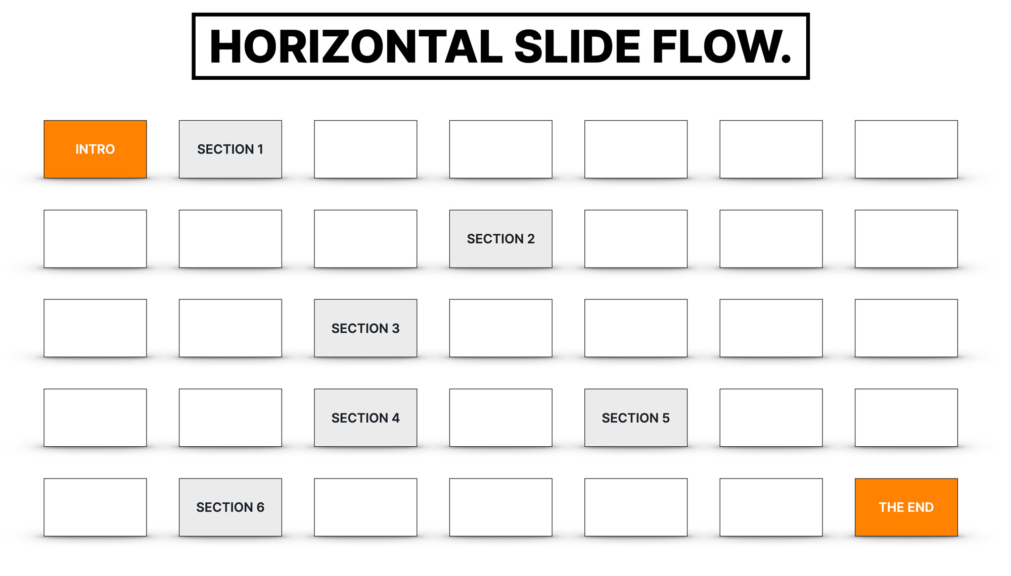
#27 How to use transitions for section slides to show the information hierarchy of your talk
A presentation is for the most part a straight-line linear flow. You show one slide after another, until you’re done. You have seven sections or chapters, they come and they go, and it feels like a continuous delivery.
There’s a brilliant technique that breaks the horizontal flow by transitioning vertically whenever you get to a new chapter in your talk. It’s a technique I learned from friend and fellow speaker Mike King from NYC digital marketing agency iPullRank.
The traditional horizontal flow looks like this:
Whereas the vertical flow looks like this:
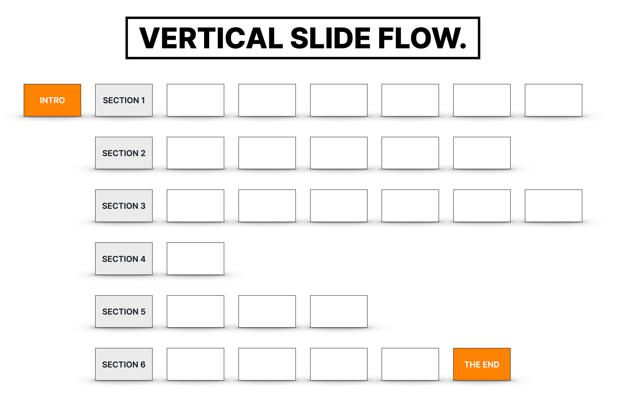
By using a transition to shift vertically down, it tells us visually that we have finished the last section and moved on to a new section. It’s a good example of an additive use of a transition to aid communication and clarity, versus trying to look fancy.
You can see how it works in the video below.
Watch how to use Grid and Push transitions in Keynote and PowerPoint to improve the perceived structure of long or complex presentations.
Part 5 – Showing Data in Your Slides
Good data visualization is not easy, but do it right and you set yourself up for having very sharable slides. On a basic level you need to consider the following points.
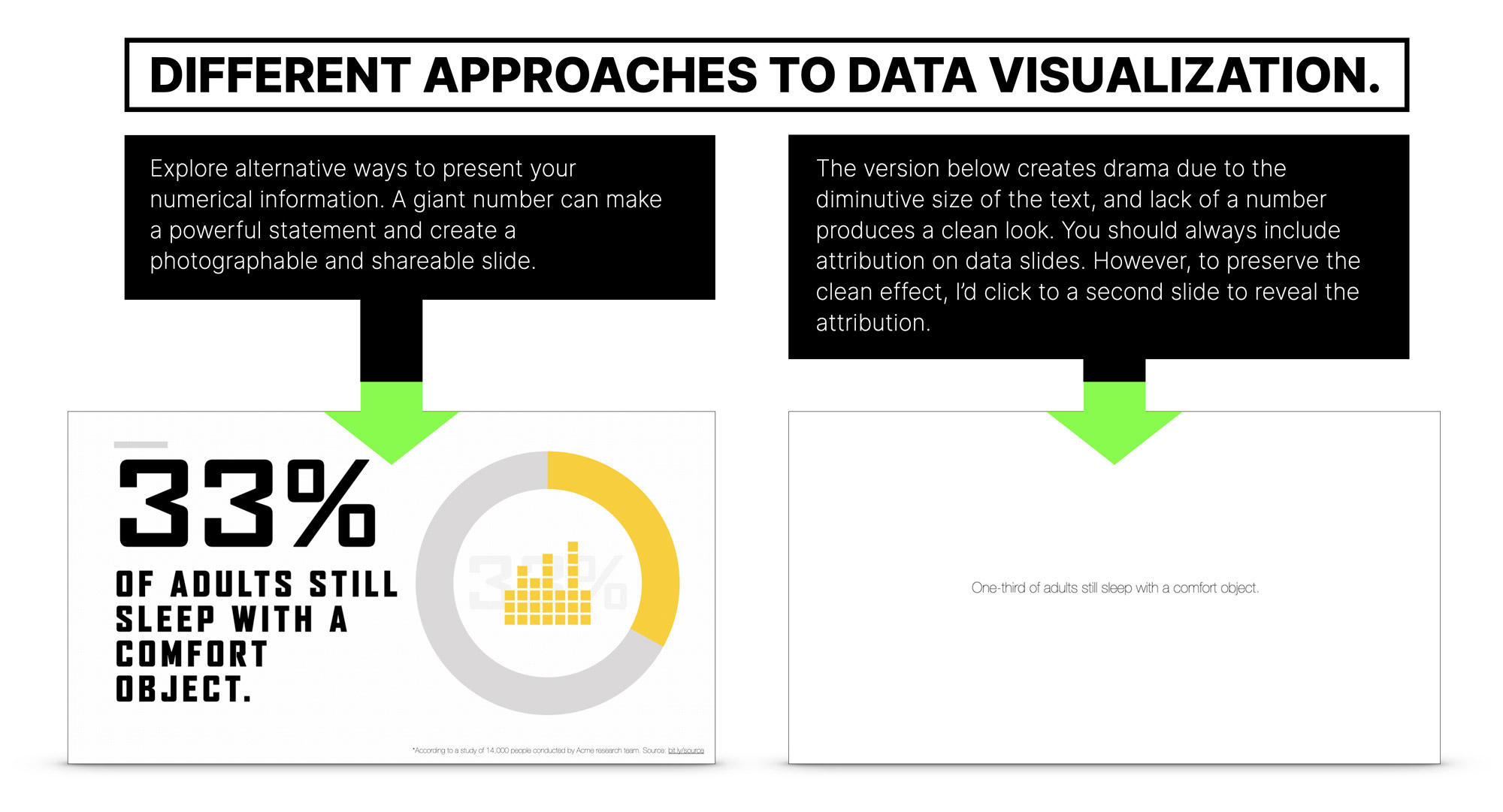
#28 Consider the format and scale of the data you’re sharing
Is it one number? A list of numbers? Do you make it big, or really small? Visuals or words?
Observe the stark difference in the examples below that demonstrate the nuances of slide design. Which of the slides below has more impact?
You might think the one on the right looks lame and boring, but from a design perspective, the stark white background and small typography creates a dramatic focus on the data point, forcing the audience to carefully lean in to read it.
Both approaches are good, but I’d recommend you try making things a little different throughout your talk to create a more varied experience.
#29 Allow the slide to stand alone with context and attribution
If you want your slides to be shared your goal should be to remove doubts and questions. Success is a reaction such as “Wow, such interesting data from Jane Doe!” vs. “Okay, but where’s the attribution? What’s the source? It’s hard to believe this is credible.”
Context is critical.
Most often it’s as simple as adding an asterisk with a source (ideally with a link) to show where the findings come from.
The first example (above) has an attribution link on the bottom-right corner, but the sparse white example doesn’t have one.
In this instance I opted for a different strategy because I felt having more text on the slide would hurt the design impact of the stark design. However, it does still need to be on there, so the way I achieved this was to duplicate the slide, with the second one having the attribution. This allowed me to lead with the design aesthetic I wanted, then after a brief moment I clicked through to the duplicate. A subtle slide design trick.
#30 Example of data visualization: Twitter Polls
Simple animations can be useful when exposing data. In the example below—results from a Twitter poll—the bars on the graph are animated to illustrate the votes actually happening. It’s not fancy, it’s just useful enough to give a brief timeline to the event.
To achieve the effect, I created four rounded rectangle shapes. On the first slide they had a width of 1px, on the second I stretched them to be as wide as they had appeared in the poll results, then I simply used the Magic Move transition to animate between them.
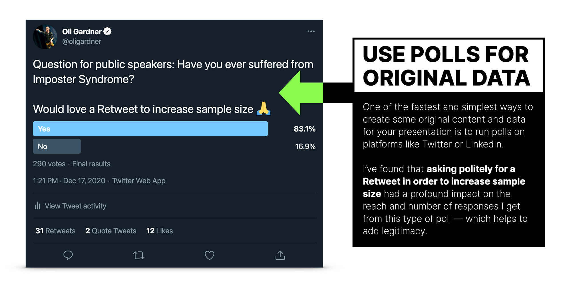
You can see how to achieve this effect in the video below.
#31 How to reveal the data on your slides to tell the right story
The manner in which you show your data is important. In the examples above, with a single data point, you’d show it all at once. But with a more complex slide that has a lot of information on it, the progressive reveal technique is a much smarter way to go.
By revealing the data piece by piece you are able to craft a more well-timed and engaging story s well as keeping your audience focused on whichever data point you are currently discussing.
Watch the video below for a full explanation of how this technique works—demonstrated primarily with bullet points).
Video caption
#32 Leave the audience with a solid takeaway
Just as context is crucial to making sense of your data’s origin, the relevance of the data to your audience is key to them taking something away that’s actually useful. Presenting Tokyo transport usage numbers to a UK transport association audience would feel like you’re not trying hard enough.
Relevance is key. Relevance with an actionable next step is a golden key of glory.
For instance, saying that “70% of B2B software companies plan to invest more in content marketing in 2021” is barely even interesting. But saying “In our research on ebook landing pages, when we asked for ‘business email address’ on your forms vs. ’email address’ we received 45% more branded company email addresses (oli@bethekeynote.com vs. oli.doesnt.use@hotmail.com).”
I can take that back to my job and make real change having been informed of that insight.
p.s. that was a real email address experiment I ran for software company Unbounce, of which I’m a co-founder. Happy to share more if you find that interesting.
#33 Using charts for data visualization
Presentation software does a pretty good job of helping you with chart options, but it’s easy to make them look bad if you’re not much of a designer.
Keynote makes it easier to keep your charts looking good but has limited options. PowerPoint has many more options and superior control over the finer details, but the designs can get a bit cheesy if you’re not careful.
You don’t want impressive data only to represent it with the world’s lamest default-style 3D pie chart.
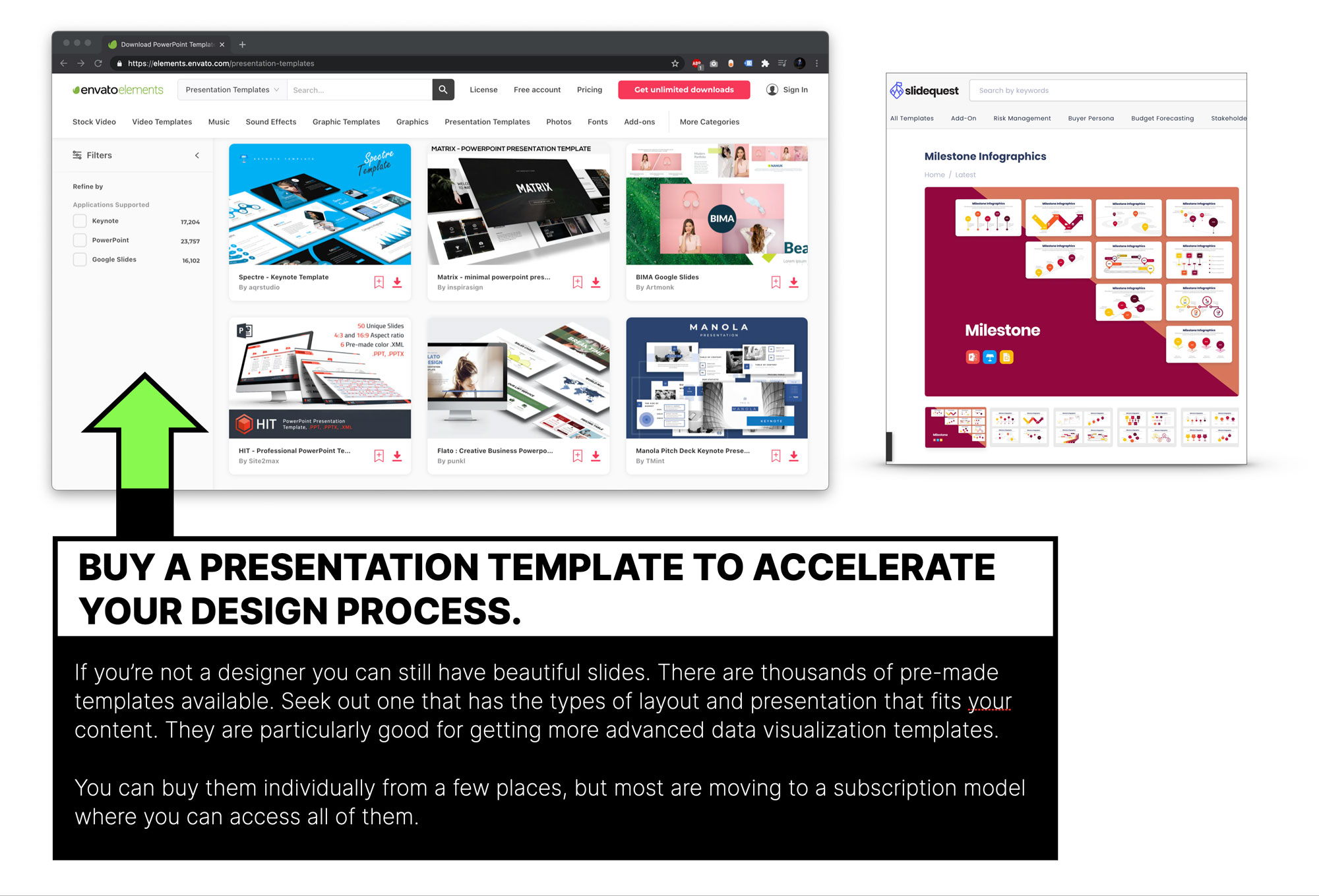
If you want to get a head start on your data visualization or you’re not a good designer, I would strongly suggest buying a template. It’s much easier to edit a design than it is to create one, so don’t be afraid to use a template in this instance.
There are many sites offering slide templates as one-time downloads or more commonly now on a subscription basis. Which leads me to my next point.
Part 6 – Using paid presentation templates to accelerate your work
#34 Why you should consider buying a presentation template
If you really want to accelerate your slide creation, you can purchase one that’s been professionally designed. Envato Elements has a massive collection. One aspect of this platform that I find most valuable is the fabulous data visualization slide designs. In the past they were available to purchase individually, but now it’s a monthly subscription that gives you access to all of them. Other sites like SlideQuest allow you to buy a complete collection at a on-off price—often on sale. An example infographic slide template with lots of data visualization is shown in the screenshot.
Part 7 – Two Quick Slide Design Tricks to Speed Up Your Workflow
Slide design is about a lot more than simple tips and tricks, but there are some that are so wonderfully simple you just need to know about them. Here are two slide design tricks you need to use.
#35 How to make a transparent background from your photos
This one is easy to find in PowerPoint, but quite buried in Keynote (and not at all possible in Google Slides).
In PowerPoint, select your image then choose “Picture Format > Remove Background” and it will highlight the areas it thinks are the background.
If it did a good job you can just accept it and the background is magically gone. However, if it didn’t select the background correctly you can manually add and remove areas to make transparent. Sadly, this is really clunky and not based on selecting areas of colour, instead you are drawing lines around areas.
How to remove the background from a photo in PowerPoint. Note, this is the Mac version of PowerPoint so there may be differences in the PC version which tends to have more features.
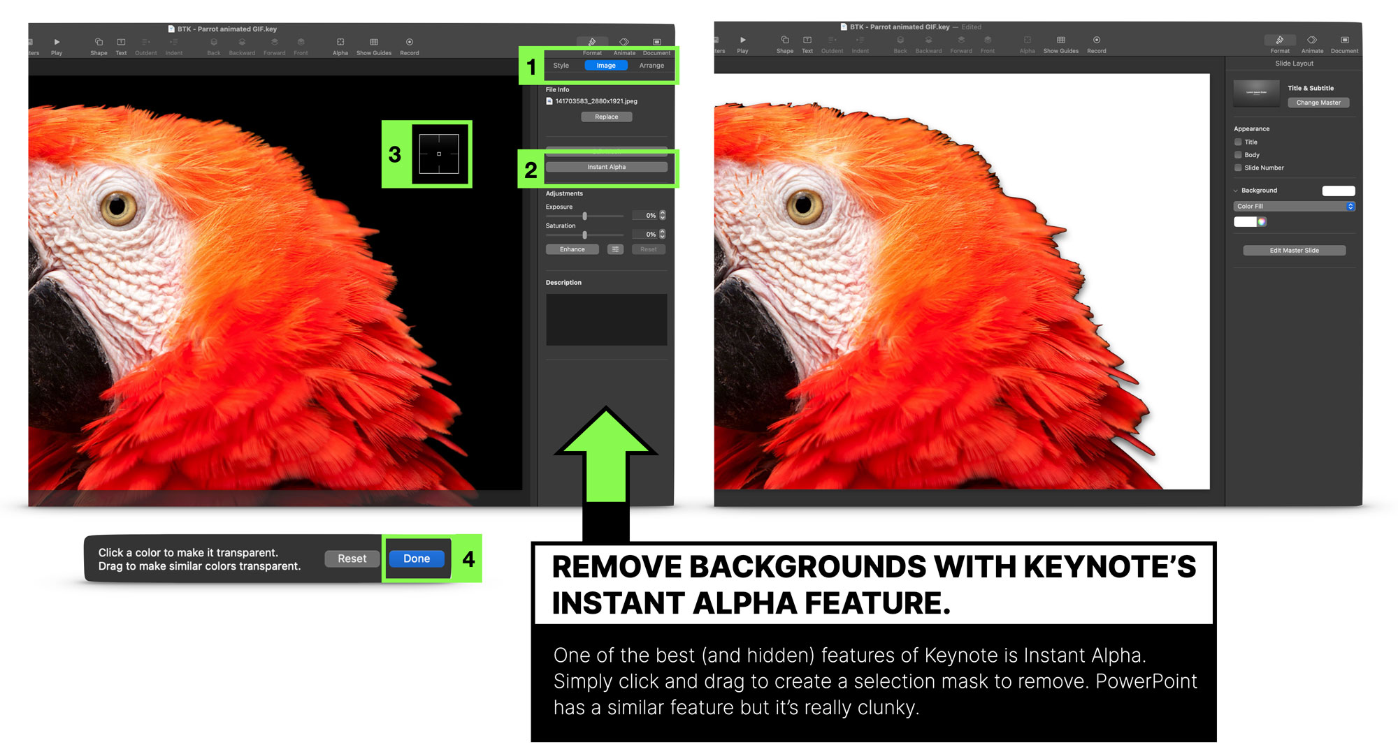
Keynote does a much better job of giving you smart controls—once you find the feature. It’s buried in the Image submenu when you’ve got an image selected. Simply click “Instant Alpha”, click on the portion of the image you want to make disappear, click the “Done” button, and poof, it’s gone.
If the colour isn’t as even as in the parrot example, click then drag your mouse to expand the selection and it’ll grow bigger, selecting more of the image. Just stop before it wipes out things you want to keep and you’re done (you may have to repeat it on different sides of the image if the colour doesn’t connect all the way around).
It’s not perfect and doesn’t work on everything, but when it does it’s a thing of beauty. Check out the video to see how powerful it is.
The video below shows how to use Keynote to remove backgrounds in three different types of image with increasing complexity.
How to remove the background from a photo in Keynote.
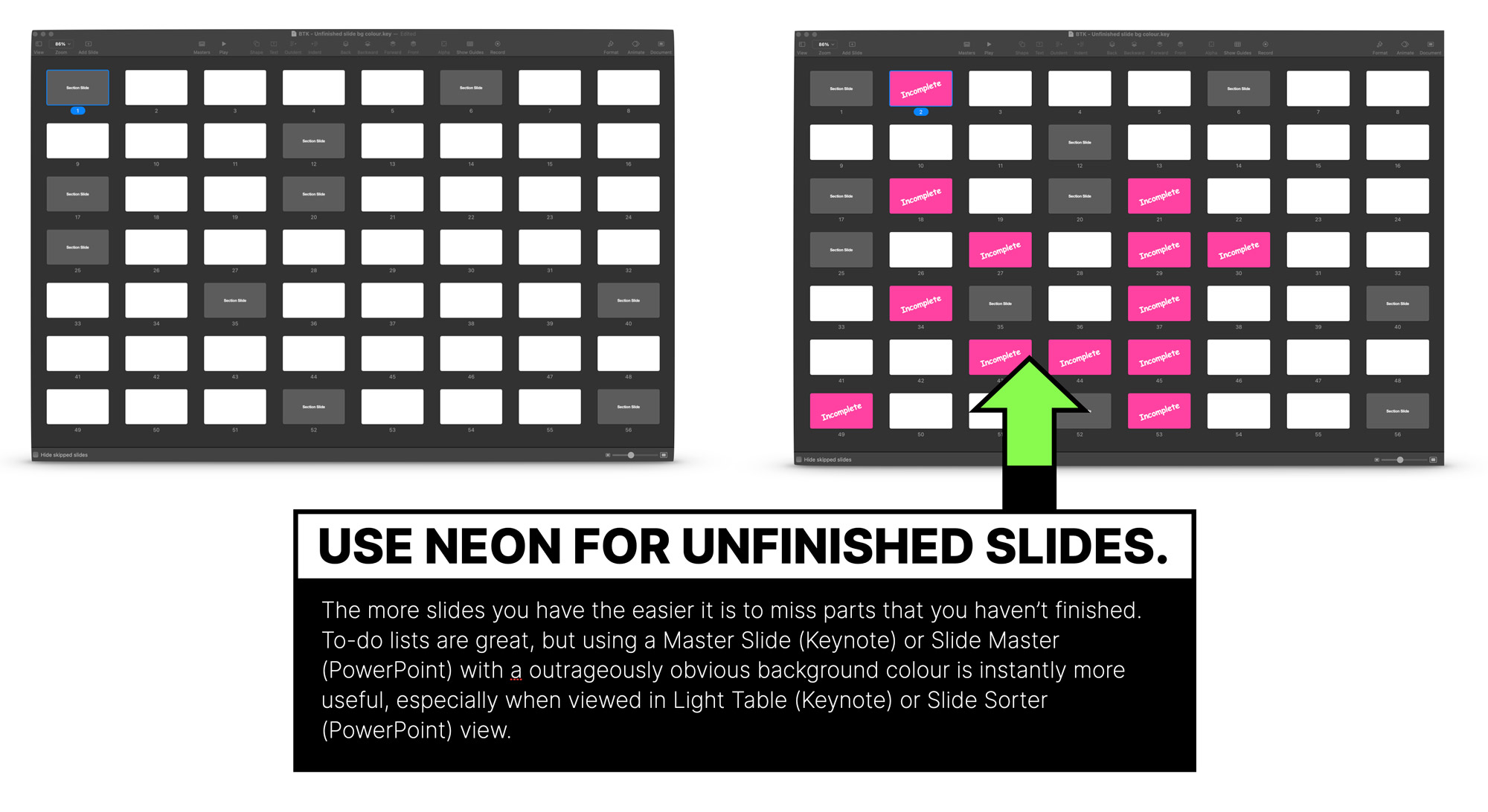
#36 How to use a crazy neon background colour for your unfinished slides
This is a productivity tip. When you start to have upwards of a hundred slides, it can be hard to keep track of ones you haven’t quite finished yet, or for when you want to add placeholders for some new slides.
To help visualize your TO-DO list, you can use hideous slides layouts with a neon background. The screenshot below shows the “Light Table” view in Keynote, which is really handy for taking a bird’s eye view of your slide deck.
For a quick demo I made a new deck with three slide layouts: blank, section, incomplete.
When the “incomplete” slide layout is used it becomes super obnoxious looking, but VERY effective at highlighting your outstanding work.
Part 8 – Making your slides Tweetable and Sharable
#37 Learn the characteristics of a shareable slide
Slides that get photographed and shared on social media tend to have a few specific content characteristics. The subject matter is usually data, results of original research, a chart outlining a new process, infographics, or something hilarious, to name a few.
But these slides still need a little help to optimize their chances, and the techniques for success sharable slide design can be applied to any interesting slide to make them more successful.
You can read an in-depth slide design tip on the topic here How to Design Massively Shareable and Tweetable Slides.
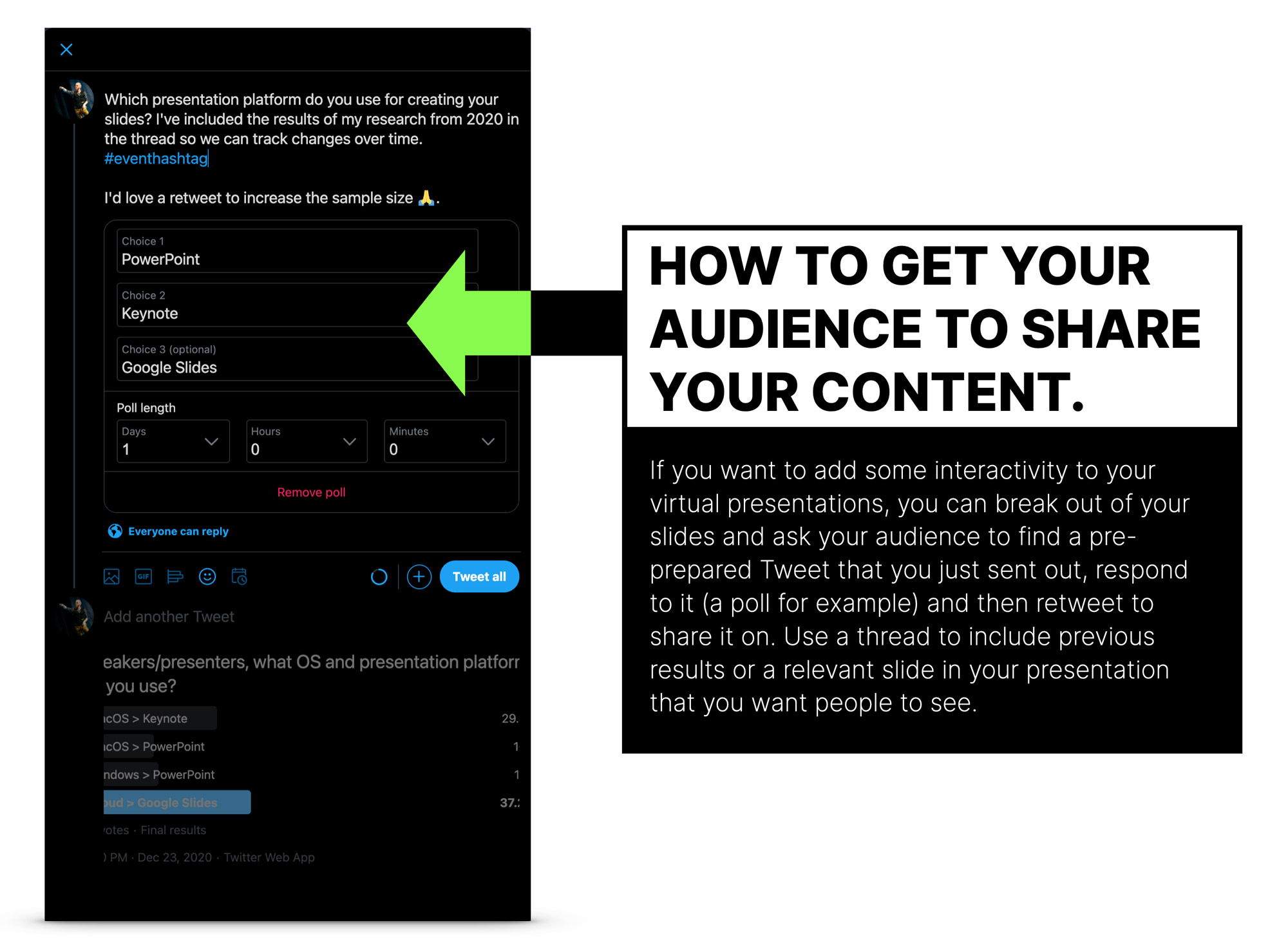
#38 How to encourage the audience to share your content when giving a virtual presentation
Sometimes you need to prompt people with things you’d like them to do, and there’s a technique you can use to help your slides be shared and exposed to new audiences. The trick is to choose a slide that your audience will have their own answer to, such as a poll, and have it tee’d up in advance.
It’s always a little risky to switch to a browser mid-presentation for an interactive segment (moreso IRL when you’re dealing with bad conference wifi), but your audience will probably appreciate the ability to take part.
I’ll use Twitter to illustrate how it works in a few steps:
- Prepare a Tweet that includes a poll.
- Add the hashtag of the event you are currently speaking at.
- Add a request for people to retweet to increase sample size.
- Add another Tweet to make it a Twitter thread.
- Add a screenshot of the slide in your talk that’s prompting this exercise (it could be results of the same poll that you ran at another time– for instance the last time you gave the talk, or just as part of your pre-talk research.
- Instruct the audience to go to Twitter and search for the hashtag to find your Tweet.
- Ask them to vote and retweet the poll.
This way you will have a group of people sharing your poll data with a new poll for people to answer and a request for others to further retweet. The effects can create a loop of interaction from fresh audiences.
Part 9 – How to Use Master Slides / Slide Layouts to Scale Your Slide Production
#39 What to do with the default template master slides
All presentation software platforms allow you to create what are called “master slides” (Keynote has respectfully changed this term to be “Slide Layouts”, PowerPoint still uses “Master Slides”). These are global templates that you use to speed up your work and keep your slides consistent. By default the layouts and designs on them are largely useless. The screenshots below shows an example of starting a new slide deck in Keynote from a template and what you get in the master slides.
If you use what the default slides give you, you’ll have a slide deck that looks too similar to others who use the same template. The image below also shows the first default title slide in Keynote and PowerPoint.
The default master slides are so generic you’ll bore yourself to death by using them. Yes, they can help you get started quickly, but if you begin with this approach you’ll only slow yourself down over time—when you learn to develop your own layouts and designs.
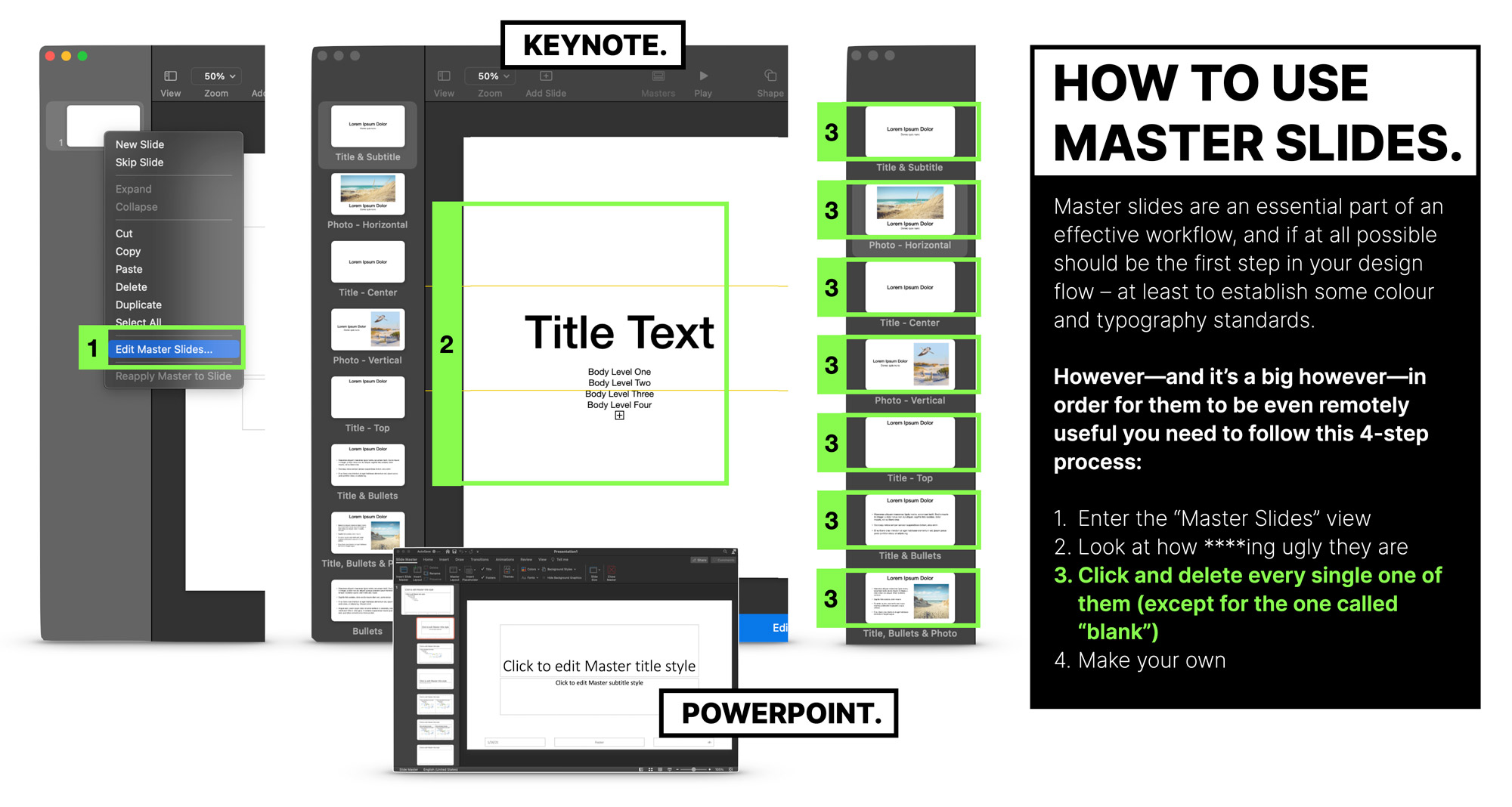
#40 The 10 master slides / slide layouts you should create for your own presentation template
The first thing I do in the slide layouts is delete EVERYTHING except for the blank template. Then I use the slide design basics section from earlier to quickly set them up. Usually in this order:
- Opening slide
- Title slide
- Chapter slide
- Recap slide
- Typographic slide
- Fullscreen photo slide
- URL slide
- Bullet slide—with the Progressive Reveal technique set up
- Q&A slide
- Closing slide
You only need to do this once—with refinements over time—and you can start with it each time you have a new talk to give.
Again, if you start with a paid template you can whip this up in no time and customize it as you figure out your theme and typographic choices.