One of the goals every public speaker should have is to create Tweetable slides that are so important, useful, engaging, snap-worthy, and unique that your audience can’t help but take out their phones to take a photo.
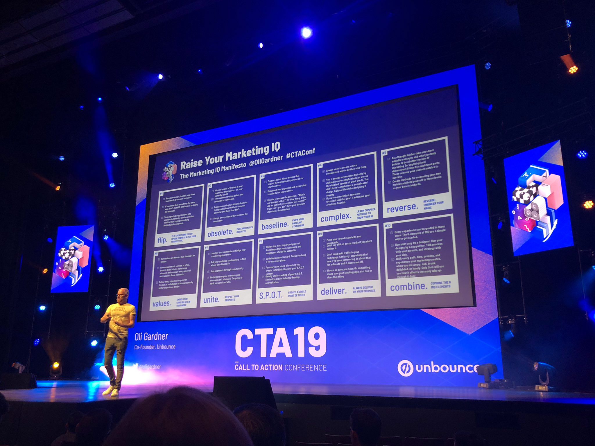
The photo below illustrates what you’re hoping for – an audience member’s view and perspective of your slides. Ideally you’d be in the frame too. In this instance I’m showing an actionable checklist at the end of my talk – which is a great way to engage the audience with a big takeaway from a presentation.

Success looks like slides being photographed from the audience’s perspective, and shared on social media.
You won’t always be able to predict which slides will have this effect (usually slides that have original diagrams, data, stats, charts, quotes etc.) – people can react in different ways to different content – so if you want attendees to share your content on Twitter (or whatever the most prevalent social media platform is for your audience) you will have a much higher degree of success if you remember two important things:
- Watch for the slides that your audience reacts most strongly to. Checking Twitter after the event is a great way to research the impact. Chances are the ones with the most photos were the ones that could be amplified further by spending more time on them.
- Design and structure your slides specifically for the purpose of being Tweetable and shareable.
The 4 Elements of Highly Tweetable Slides
When designing a slide that you want people to share, consider the following elements.
- A strong hero element, for example:
- A bold or controversial typographical statement
- A chart or large numerical statement if you are showing data
- A unique diagram for a new process or workflow
- An actionable checklist
- A downloadable giveaway such as an ebook
- Your name or social media handle.
- The hashtag of the event. This makes it easier for attendees to share it after they take the photo. It also provides context for references in the future.
- Remember to include attribution links to any data or information sources that would be required for validation purposes. These can be small footnotes so they are available but not visually dominant.
Designing slides that are highly Tweetable and sharable is a great technique for amplifying the impact of your presentations. But those awesome slides won’t do you any good if you don’t give people the opportunity to share them.
How to Maximize the Audience Taking Photos of Your Slides
- If you notice people raising their phones to take a photo, pause for a while to let them do it. If you don’t feel comfortable remaining silent while this happens, continue to talk about the slide and maybe go into more depth.
- You can encourage more photos by calling it out saying “I’ll leave this one up for a few seconds if you want to take a photo”. Your audience will thank you for it. This lets those who are doing it to get a good shot and it can make others take out their phone to join in.
- However, don’t tell people to take a photo if they are not showing any interest in doing so.
Examples of Shareable & Tweetable Slides
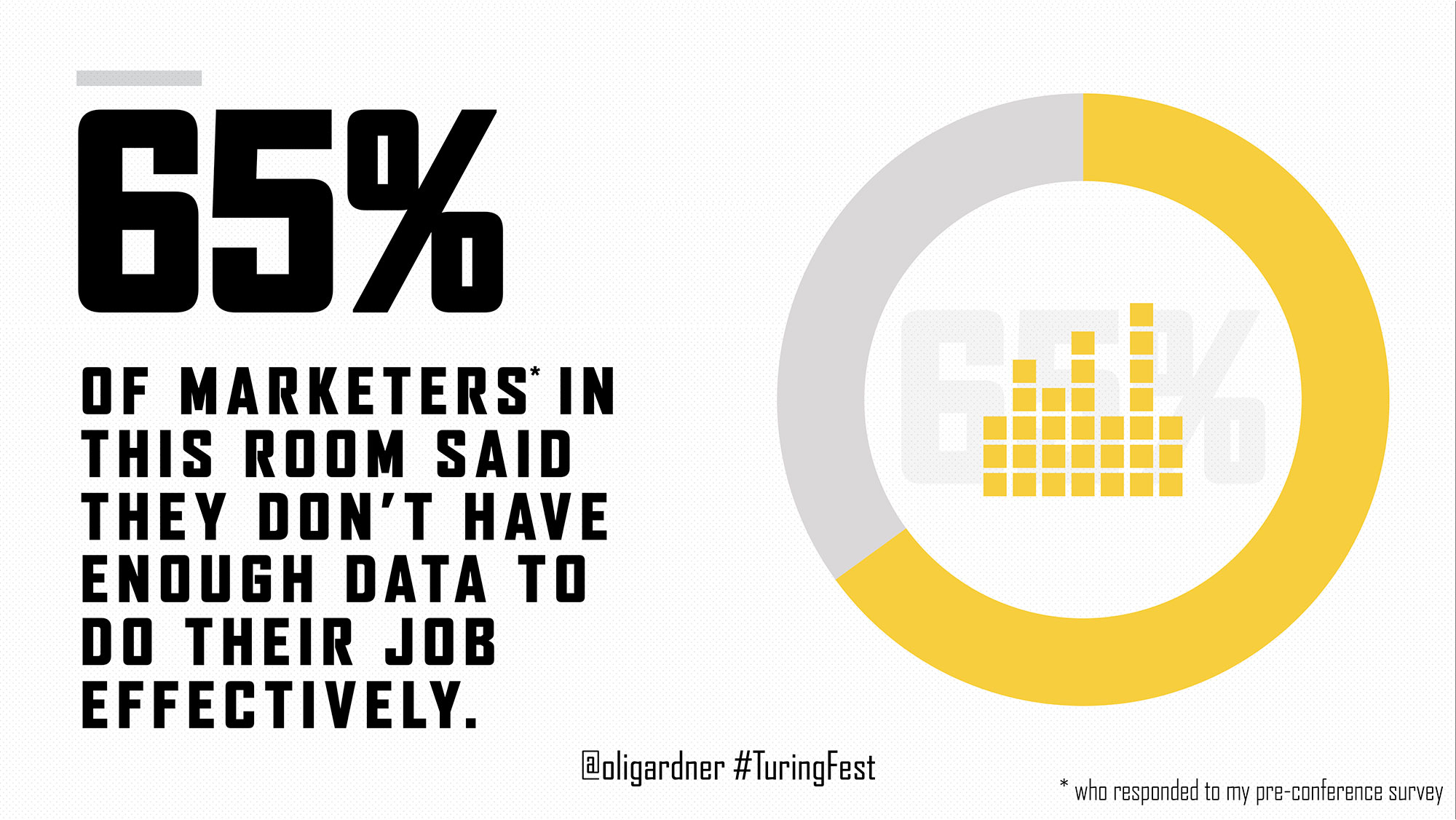
The first example shows a datapoint from some research I performed. Because it’s original research the information becomes more valuable.

Be as big and bold as you can when it comes to numerical information, and combine numbers with visuals such as graphs or charts. If you have more data than you can share in your talk, add a slide linking to a downloadable PDF or website that will allow them to explore. If you want to get doubly smart, use a dedicated landing page for them to visit so you can gauge the interest and build some attribution data for your talks.
In the second example, I’m showing a very comprehensive historical timeline of design trends. When it comes to designing Tweetable slides, content that shows an authoritative view of your theory or big idea give the audience an anchor point that helps them see the defining moment of your talk. This type of slide takes a long time to create but it can pay off in a big way.
Video powered & sponsored by Wistia
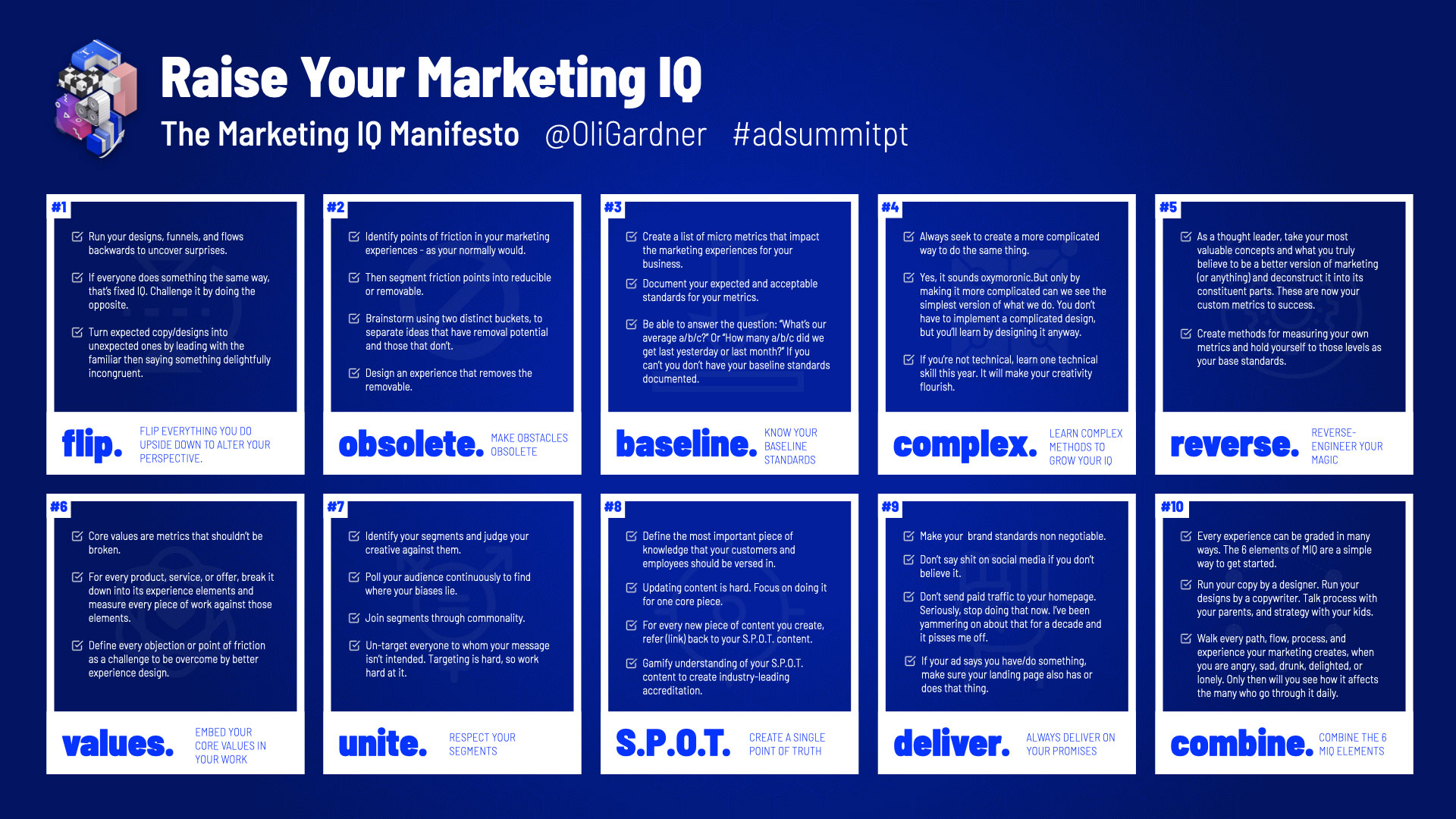
And in the third example is an actionable checklist that the audience will want to use after the talk.

The benefit of a really detailed slide is that the audience will want to take a photo (or get your slides after) so that they have time to consume all of the information. They’re also great for including in blog posts.
Tip Recap & Actionable Checklist
In business as in life, you get what you ask for. Now your job is to ask (through smart structural design) your audience to photograph and share your best slides.
I’d suggest that you do four things:
Create a master slide deck of your most important and sharable slides.
Structure your best slides so they contain the core elements of a sharable slide.
Search Twitter (or other platform) to figure out which slides have been shared the most in the past, and take screenshots of your own for social proof that you can add to your speaker page.
Pay attention the next time you speak.
- If it’s in person, watch the audience carefully to see when they reach for their phones (to take a photo, not check Facebook), and check the event hashtag afterwards to see what was shared.
- If it’s a virtual event, make sure to encourage attendees to share their favourite slides on Twitter as you won’t be able to see them and asking for interaction can help and also give you a gauge of success.
Happy presenting!
Oli Gardner
Founder, Be the Keynote.